When writing a fully-fledged book, it is essential for one to focus on the most minor of details and especially paying considering fonts for your book layout.
Many people think fonts are irrelevant and don’t matter as long as the writing is good, but that is not true. The decision of the font can also do damage to a book or make it better.
When deciding fonts for your book layout, there are a few things to keep in mind, like how the eyes would take it and how it would fit with your writing since an unsuitable match would only mean trouble.
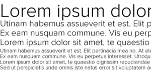
– Palatino
Credit: TeX Users Group
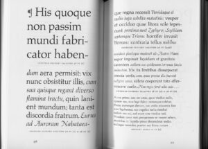
Made in 1949, this particular font was mostly made for headings and small things like postcards, ads, invitations, etc. But it had started becoming popular incredibly fast and people started using it for book text and eventually was changed the tiniest bit to improve its readability.
– Didot
Credit: Luc Devroye
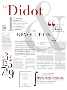
If looking for something slightly more formal, Didot may just be the perfect fit for you.
It’s traditional, yet with a modern feel to it makes this font perfect for things like brochures and even some industries fit extremely well with it like lifestyle industries, and more for example fashion and home & garden.
– Garamond
Credit: Quora
The Garamond family of fonts had quickly risen to the dominance of the standard in Microsoft Word. The original font was actually made after the 16th century’s engraver Claude Garamond.
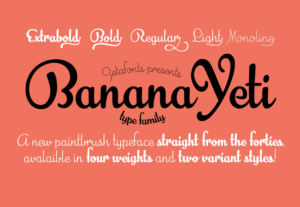
– Banana Yeti
Credit: BeFonts
This font has an air of vintages to it, as well as the charm to make it look as if it’s handwritten. For companies looking for something vintage, they might have just hit the jackpot but the 40s era vibe doesn’t suit everyone.
– Caslon
Credit: Wikimedia Uncommon
Moving away from the imported dutch style that was common in England at the time. William Caslon designed the Caslon font with inspiration from the English typographic style.
– Jenson
Credit: Fontsgeek
A more recent addition to the world, Jenson was a font designed specifically for the Adobe Systems but is actually based on a text face cut by Nicolas Jenson in Venice around the time of 1470. The font Jenson is also considered one of the most readable typefaces.
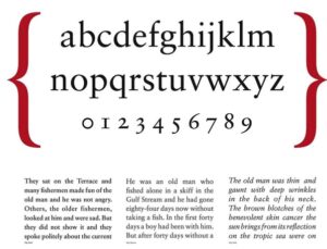
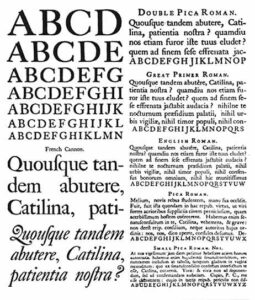
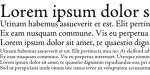
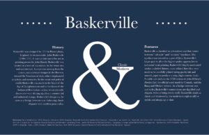
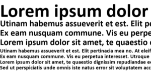
– Baskerville
Credit: Dmcwo.github.io
Baskerville was originally a novel known for its choice of contrasting thick and thin strokes.
The creator of this font, John Baskerville was also very influenced by his background of calligraphy.
– Calibri
Credit: Fontsgeek
This font is famously known as the default for Microsoft word. Calibri is a versatile sans serif font that a lot of people are originally familiar with.
The font gives us a round and a friendly feel to our words and goes perfectly with multiple uses.
With the strokes that present a modern yet contemporary look, This font is usually one that works for most things.
– Proxima Nova
Credit: Fontsgeek
Although the font isn’t that well known among the public, it certainly is always a common option for designers. This minimalist type font works well with subheadings but having it in the middle of your work can be a little heavy and as they say, a little can go a long way.
– Captain Comic

Credit: Smashing Font
The slightly older sister of the font Comic Sans, This font was deeply inspired by the incredible lettering usually seen in comics.